I-Team: How Accurate Are The 'Alarming' Coronavirus Curve Graphs?
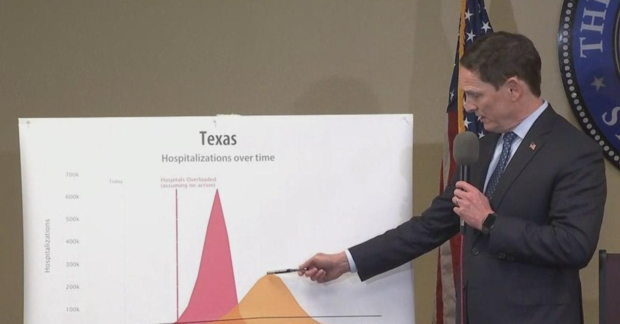
DALLAS (CBSDFW.COM) - When Dallas County Judge Clay Jenkins issued a stay at home order Sunday, he pointed to a curve graph.
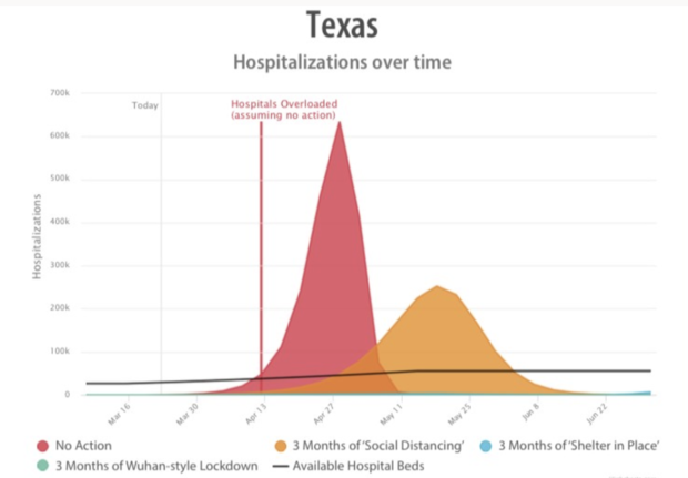
According to the projected numbers referenced by Jenkins, with three months of only 'social distancing' measures, Texas hospitals will be overloaded by April 28 and a projected 430,000 Texans would die from the virus.
Jenkins said this is why a more stringent "shelter in place" order is needed.
The projected numbers of hospitalizations and deaths have been met with skepticism by critics of Jenkins' orders - some questioning their accuracy and source.
The chart used by Dallas County is from the website covidactnow.org.
The website was started by a team of data scientists, engineers and epidemiologists.
It has been endorsed by several doctors and leading public health officials.
The site makes all their raw data and calculations available to the public to view.
According to site, the model is "intended to help make fast decisions, not predict the future."
Harry Glorikian, a health data expert and author of Moneyball Medicine, said, like any coronavirus projection, its accuracy is currently limited by the lack of available data.
Since so few people have been tested for virus, there is little data as to how many people in the U.S. actually have it.
Without that key piece of data, Glorikian said it's difficult to project cases, hospitalizations, and deaths.
"We are lacking so much data right now that we are completely, from a medical profession, in the dark on how to manage this," Glorikian said.
The lack of testing data has led to wide range of projections, but Glorikian said while the numbers vary nearly all are pointing to a similar future.
"Every projection that I've seen so far – high, low medium - it is going to out stretch the number of beds we have in the United States," he said. "Either way we are not in good shape."


