Quick fix for dyslexia? Dyslexie font shown to help
Trouble reading? It might be the font. That's the idea behind a new typeface called "Dyslexie," designed by Dutch graphic designer Christian Boer with the help of research done by the University of Twente in the Netherlands. Boer designed the font for himself and millions of other people with the reading disability dyslexia.
"People with dyslexia reflect letters like in a mirror, rotate them and mix them up," Boer says on his website. So what does Dyslexie do? It emphasizes the differences in letters that look similar - and was proven to help readers with dyslexia. Keep clicking to see just how it works...
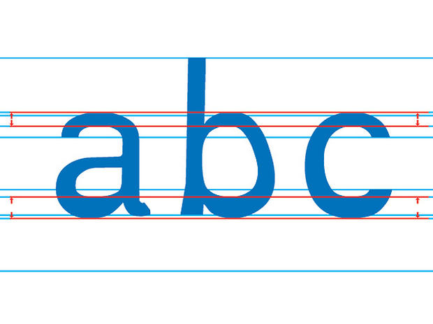
Letters in Dyslexie are weighed heavier at the bottom. When the letters are next to one another, they create a solid baseline and the letters won't be turned upside down - which often happens with dyslexic readers.
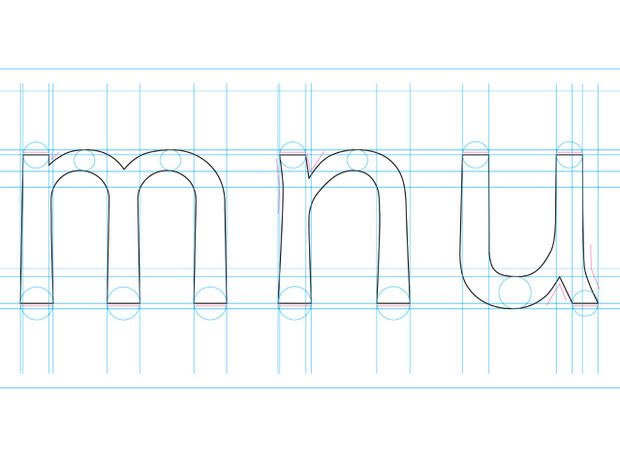
The spaces inside letters are enlarged. This makes the individual form of the letter more obvious, and letters look less like one another.
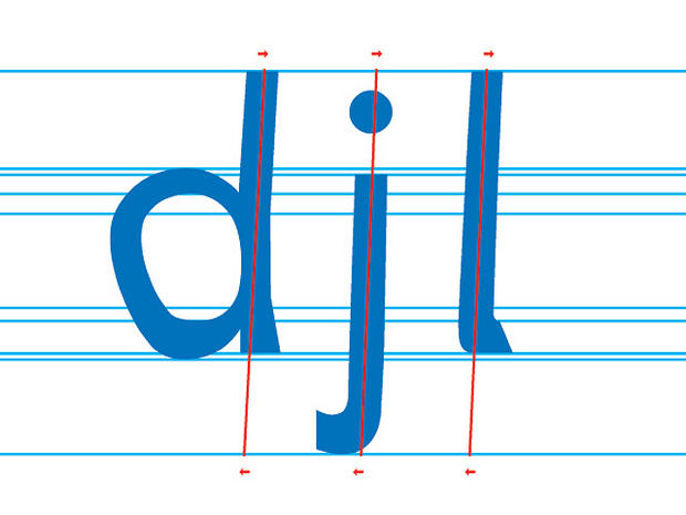
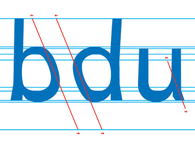
A few letters, like these, are made a bit italic - so they resemble handwritten letters and look less alike.
Characters that look very similar are given an extra "tail," so they're less likely to be rotated or reflected.
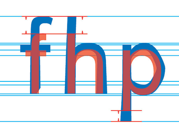
Letters with "sticks" are made longer, to define their shape more.
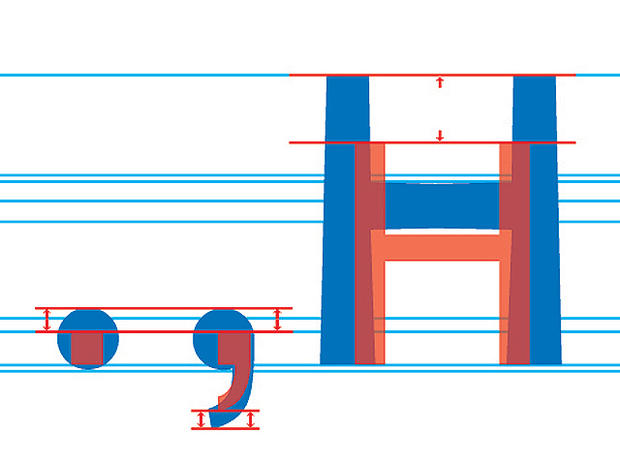
Capital letters and punctuation marks are made extra bold, so that they stand out more when beginning, ending, or interrupting a sentence. This way, people with dyslexia are more likely to read each sentence separately.
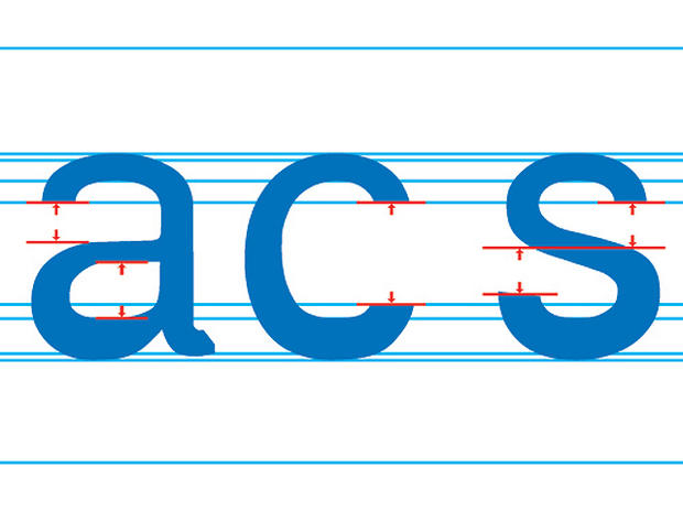
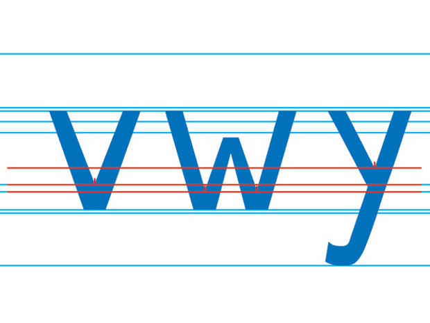
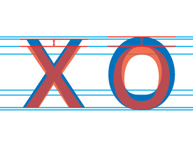
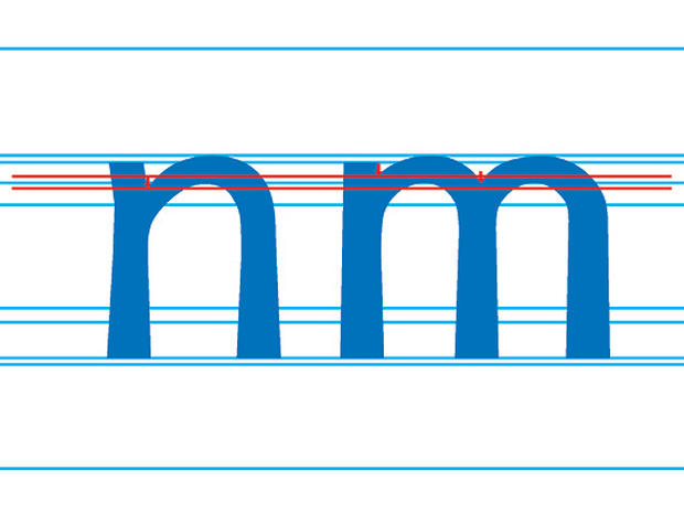
Elements of letters that look similar are made different heights, so that each letter has its own distinct features.
Certain letters are made higher but not wider, making them stand out more and easier to recognize.
Parts of similar letters, like these, are made different heights - so it takes less energy and concentration to read them separately, Boer says.
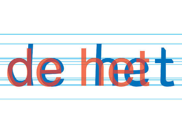
In these words (Dyslexie in blue and a standard font in orange), it's clear that the words and letters in the font for dyslexics are wider apart. These spaces make the text easier to read.
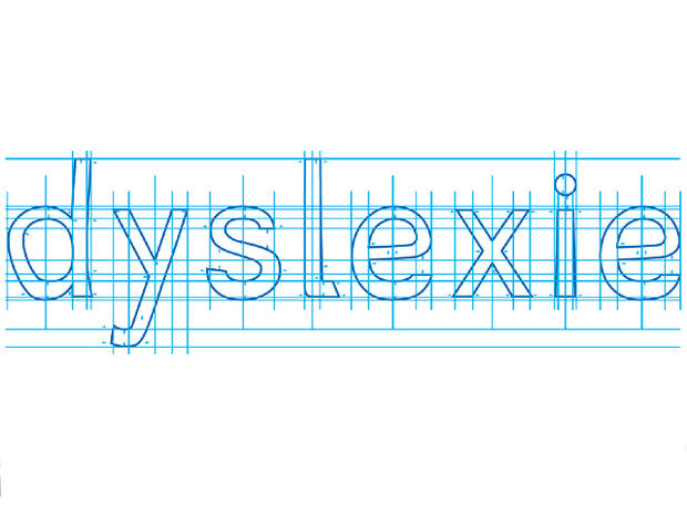
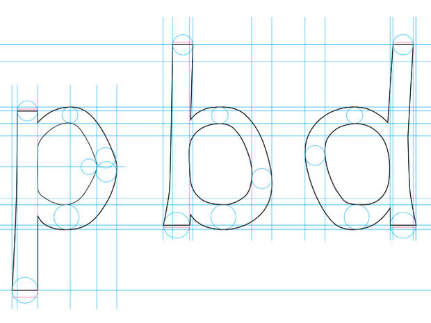
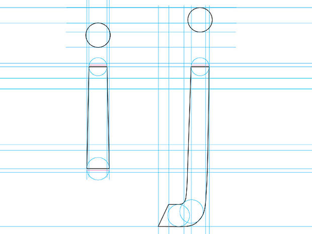
Boer measured every detail of each letter when designing Dyslexie.
He paid close attention to letters that look especially similar, such as i and j.
These letters are especially likely to be inverted by dyslexic readers.
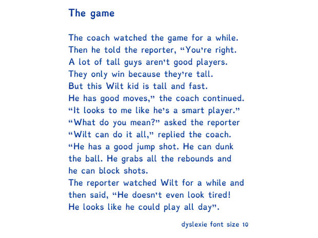
Here is a sample text written in Dyslexie. Researchers at the University of Twente found people with dyslexia made fewer reading errors when they read text in Dyslexie versus in a standard font.
