Nutrition Facts a flub? Designers rethink food label
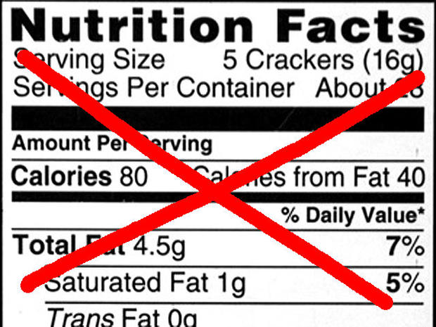
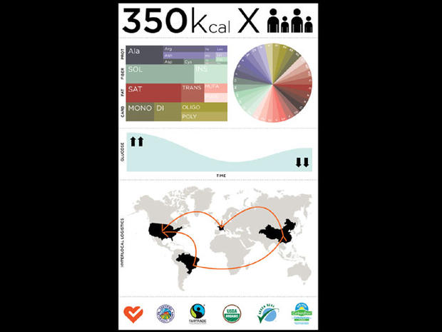
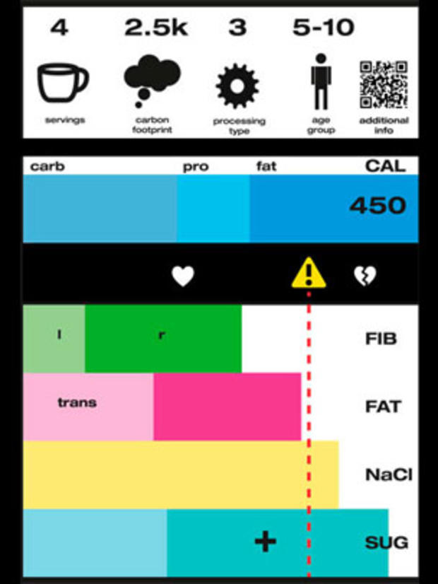
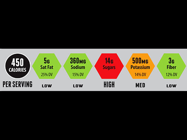
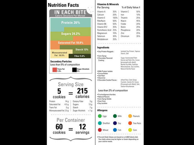
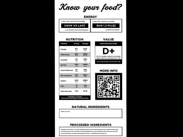
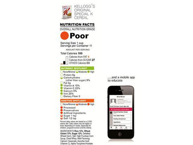
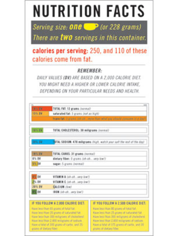
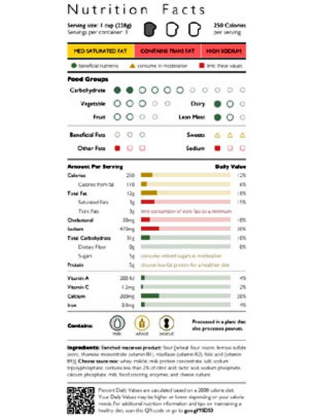
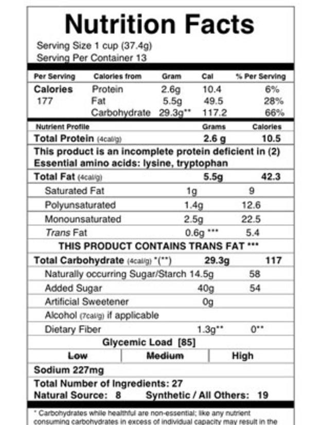
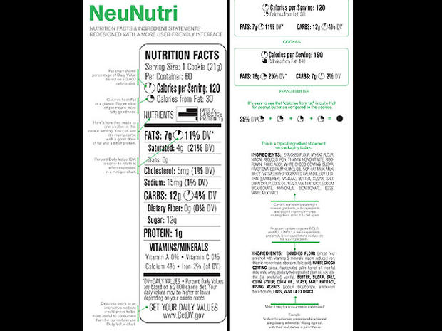
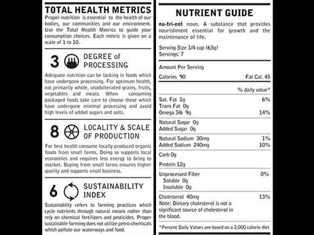
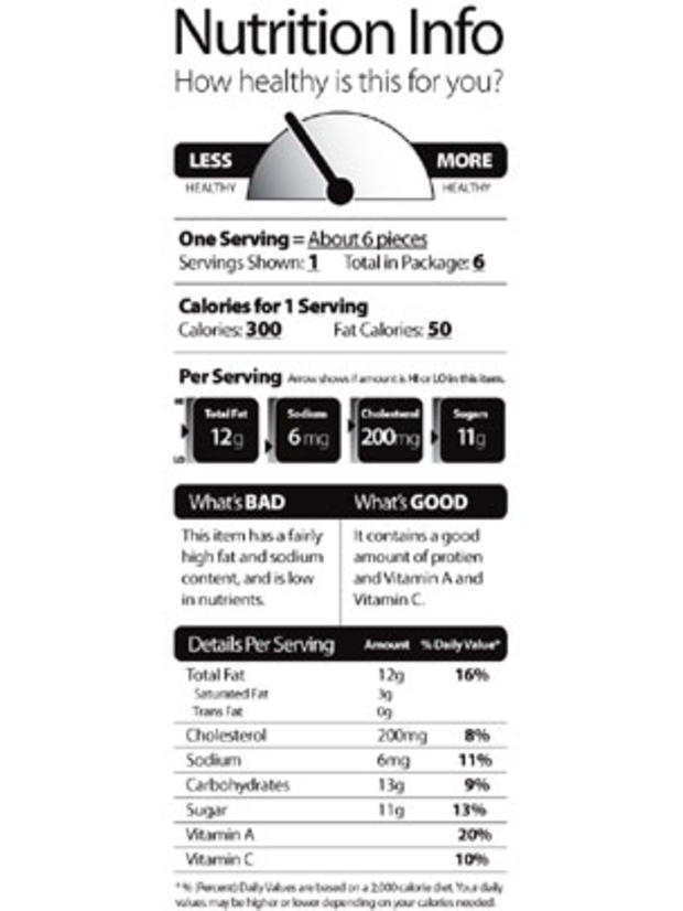
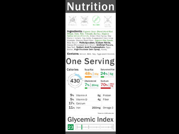
The familiar "Nutrition Facts" label seems almost as bland as some of the food it's slapped on. Would a more appealing label help consumers make healthier food choices? That's the idea behind a new label design contest held by the University of California, Berkeley's School of Journalism called "Rethink the food label." The entries were judged by a panel of experts including food writer Michael Pollan, consumer health activist Michael Jacobson, pediatrician Dr. Robert Lustig and two design experts. From humble to high-tech, the contestants came up with some pretty amazing designs. Keep clicking to see the top 25 entries and don't stop until you reach the winner...
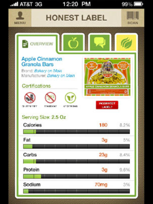
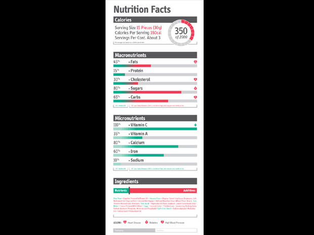
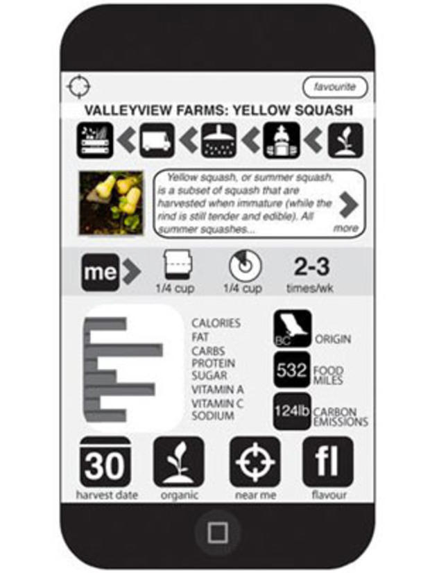
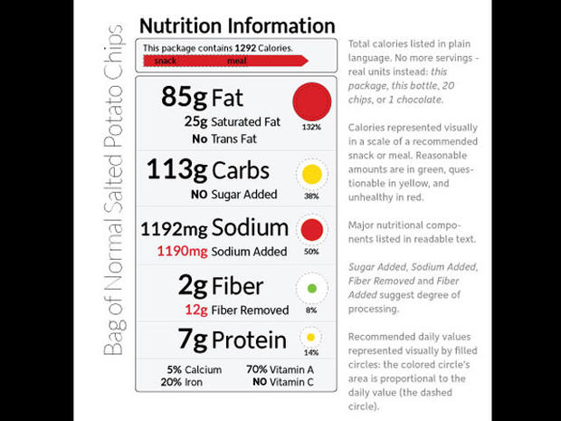
This digital design by Honest Label Foods kicks off the list of top 25 submissions to the food label redesign project. The design brings nutrition facts to mobile apps, so you can scan barcodes on the go.
Designer: Fabius Leineweber
Designer: Daniel Campuzano
Designer: Gary Holmes
Designer: Christopher Griego
Designer: Brian Cook
Designer: Myrak Klockenbrink
Designer: Evan Corpuz
Designer: Samantha Lefort
Designer: Tommy McCall
Designer: William Hilson
Designer: Dan Becker
Designer: Franklin Gaw
Designer: George Kokkinidis
Designer: Jean-Haejin Shim
Designer: Maria Hernandez
Designer: Michael Phan
Designer: Grant Roberts
Designer: Yael Miller
Designer: Nick Huard
#4
Designer: Josh Jeffrey
#3
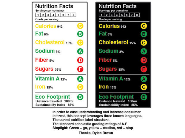
Inspired by the "known languages" of the current nutrition label, the letter grading system, and traffic lights, this design by Dylan Brown kicks off the top four entries in the competition.
#3
Designer: Bradley Mu
#2
Designer: Joey Brunelle
#1
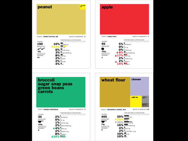
Voted number one by several judges, this winning design by Renee Walker uses colorful boxes to show the proportion of ingredients in a product. "Walker
