Uber rebuilds its app from the ground up
Uber is trying to save passengers time.
How? By completely overhauling its app, putting a focus on speed and efficiency.
“It’s not just a normal update,” Uber CEO Travis Kalanick said during a press briefing Tuesday at the company’s swanky San Francisco headquarters. “This is a radical redesign and rebuild of the app from scratch.”
Uber’s premise is simple: It pairs drivers with passengers via smartphone app. In the past seven years, it has gone from a small startup to one of the largest ride-hailing services on the planet, operating in more than 70 countries. With a valuation of $68 billion, Uber is also the world’s highest-valued venture-backed company. But with the expansion, the company appears to have outgrown its app.
“Over the years, things got more complicated,” Kalanick said. “We needed a new system to deal with the growing set of features that were piling up on an older design.”
It’s not just the app that’s had more layered onto it. Uber, the business, has been dabbling in self-driving cars, and its fledgling freight division last week made a splash with a delivery of beer by self-driving truck. Like many other Silicon Valley stalwarts and startups, it sees artificial intelligence factoring heavily into its future, and just last month, Kalanick said Uber is in “the very beginning stages of becoming a robotics company.”
Uber’s last major app redesign was in 2012, when the company launched a feature that showed little Uber cars roaming city streets. Since then the app has gotten crowded. The company jammed more and more features into the app until it there was little space left. Loaded with junk, the once-sleek design had become hard for users to navigate.
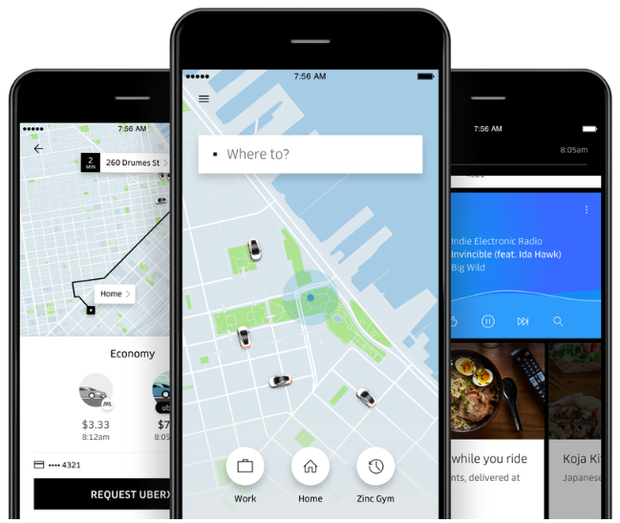
The current overhaul, which begins rolling out globally Wednesday, was designed with a bevy of improvements in mind, including a faster app-loading time, more efficient passenger pickups and a personalized user experience.
With the redesigned app, passengers are greeted with the question, “Where to?” They can type in a location or select a personalized suggestion that appears on the screen, such as home, work or a friend’s address. At the bottom of the app, people can choose what kind of ride they’d prefer, such as economy or premium, and see the cost differences.
“Because we have your destination, we can calculate exactly how much you’re paying,” Yamashita said. The app can also show the “time we expect you to arrive at your destination.”
The app comes with various other features as well. For instance, users can connect their phone’s calendar to the app so Uber will know when and where they’re going. There are also “optimized pickup points,” which show passengers the best location to meet drivers based on final destinations and things like one-way streets.
Another app addition is the “Uber feed,” a scroll of information and social media features for people to peruse during their ride. For the feed, Uber partnered with Yelp, Foursquare, Snapchat and Pandora, and plans to announce more partners soon.
As part of the personalization of the app, riders have the option of selecting a person as their destination. “A lot of people are Ubering not just to places but to people,” Yamashita said.
The way this works is that users sync their contacts to the app and then request Uber to take them to a friend; the app will notify the friend and ask for permission to share their location. If permission is granted, an Uber driver will take the passenger to the friend.
Riders have been asking for many of these features, company representatives said.
However, a few features, most notably safety enhancements, didn’t appear in the app revamp.
After a slew of alleged sexual assaults by Uber drivers, some women and lawmakers have called on Uber to add more safety features to its app, like a panic button. Though Uber representatives said safety is a priority, the company is not adding such a feature at this time.
As for drivers, their version of the app will remain the same. The main changes drivers will see are easier pickups because of the new “optimized pickup points” feature on the passenger app, company representatives said.
“It’s not a starting point or an end point,” Kalanick said of the app redesign, “but it’s how we like to think of where we are.”
