Early look at Microsoft Windows 8 beta
(CNET) Microsoft pulled back much of the scaffolding and secrecy surrounding Windows 8 today at Mobile World Congress. I've been using the Windows 8 beta (download), officially known as the Windows 8 Consumer Preview, for the past week, and it's by far the most integrated and most capable operating system Microsoft has ever put out. The question is, will enough people care?
There's a phenomenal amount of change here to discuss, but if you're looking for a quick summary: Windows 8 is a breeze to use. It's tricked out with social networking and synchronization, it's robust enough to handle Photoshop, it gracefully moves from touch to keyboard and mouse, and it's got some top-notch security.
Despite what Microsoft is calling strong interest from hardware manufacturers and developers, however, its impact is still uncertain at best.
Windows 8's predecessor could be summarized six words: Windows 7 is Vista done right. Windows 8 is a much harder sell for reasons intrinsic to Microsoft itself, its hardware partners, and the whims of consumers.
First, when Windows 8 launches it will be the most ambitious operating system ever, with a workflow that's easy once you learn it, but not necessarily obvious at first blush. Second, more of your Windows 8 experience will be dependent on your hardware than ever before, because it will work on both actual PCs--i.e., desktops and laptops--and tablets.
Last, and this is the one that won't be resolved until Windows 8 starts shipping to consumers in the second half of this year, there's no strong evidence that Windows 8 is what consumers want next. Do people want tablets that aren't made by Apple? Is the tablet more like a larger smartphone, or a thinner laptop? Is there interest in one operating system that offers both casual touch and robust power modes?
Logging on
Windows 8 offers some great log-on options. You can choose to create a local account, but the OS becomes infinitely more useful when you use a Microsoft account. You'll be able to synchronize to it your Windows 8 settings, including Internet Explorer history. This means that when you log in to any other Windows 8 machine with that account, your data will sync, including background settings, address book, other accounts like Facebook and Twitter, e-mail, and instant messaging.
App syncing is planned for the Windows Store, too, while the SkyDrive integration can be used for syncing files.
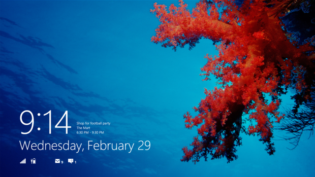
Beyond sync, once you've logged on for the first time you can change your login scheme to a PIN or a picture login. The picture login is quite cool, and lets you set a photo as your login background. You can then customize a quick series of drawings on the picture, made up of a line, a circle, and a dot, to log you in.
I was able to choose my photo login from my Facebook photos, which I had synced using the native Photos app that comes with Windows 8. The process was easy, and the photo picker tool in Settings connected through the Photos app to provide access to my Facebook account.
In drawing my login on the photo, there were times when it worked on the first attempt, and other times that required multiple attempts. This appears to be more related to the hardware than anything else.
A killer feature that missing would be facial recognition logins. The better of these apps have been proven resistant to printed photo hacking, and it would extremely useful to have a webcam recognize your face and log you in without having to physically touch the computer. At least nobody else has this integrated into the operating system yet, but since third parties like KeyLemon and FastAccess have been working on their versions for a while, expect it to arrive in with the big players sooner rather than later.
Navigating Windows 8: Touch
You can navigate around Windows 8 in two ways, and they work well enough that you can use them simultaneously--assuming you're into that kind of torture.
As we've all seen, Windows 8 is highly grope-able. It wants you to touch it, and frankly touch is the easiest way to get around. Unfortunately, at this point the Windows 8 beta doesn't come with a quick tutorial, and although the workflow is easy, it's not necessarily obvious.
Windows 8 is all about the edges of the screen. You swipe in from the right edge to reveal the Windows 8 charms. These include the instantly-recognizable Search, Share, Start, Devices, and Settings. The Start button returns you to the Start screen, which is what you see after you log in and where Microsoft expects most of your activity to take place. Once you've launched at least one app, you can swipe in from the left edge to return to the last-open app.
You can also perform a U-turn from the left edge. Swipe in a little bit, then swipe back to the edge, and instead of pulling forward the last app you used, you'll get a sidebar of thumbnails of your last six apps. At the bottom left corner of the thumbnail bar is a thumbnail of the Start screen, providing another way to return "home." So yes, the familiar Start "button" is hidden, but no, it's not hard to get to. It takes about the same effort to get to the Start screen from either edge.
One of Windows 7's better interface features was a split-screen view that you could initiate just by dragging one program's Title Bar to the left or right side of the screen. This has been updated for Windows 8. When you drag an app from the left edge, if you drag it slowly and hold it near either the left or right edge, a vertical separation bar will appear. Once the bar shows up, release the app and it will "snap" to the edge. The screen will be split, with one-third for the app you just dragged over, and two-thirds for the previous app.
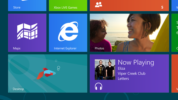
Tiles, Microsoft's term for its app icons, are arranged in groups. A long press on a tile will select it, and you can change its position or group from there. You can also pinch to zoom out and get a global view of your groups, or create custom groups by dragging a tile to the right edge and releasing it.
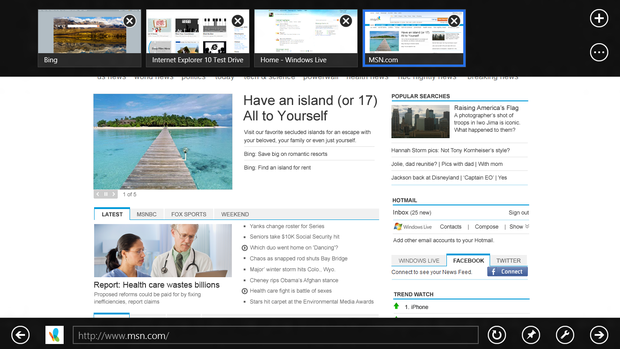
Where the left and right edges are global, the top and bottom edges are for the apps themselves. In Internet Explorer, for example, this means that your location bar is at the bottom, and your tabs are up top. On the Start screen, you can get a list view of all your apps. In Mail, you can set up accounts--including non-Microsoft ones like Gmail, create folders, sync and more.
This worked well in almost all cases. The only one that caused me problems was the Calendar, where about half the time swiping from the left moved me back a day instead of pulling me into my previous app. Again, this could easily be a factor the demo device Microsoft lent me, a Samsung tablet currently available in stores with Windows 7.
The Desktop tile will jump you directly into a Windows 7-style desktop, complete with Recycle Bin, traditional Internet Explorer, Windows Explorer, and taskbar. A keyboard icon next to the system tray forces the Windows 8 soft keyboard to appear, with options for splitting it for vertical orientation, or using a stylus for handwriting recognition. The side edges still work here, though, and it's much more responsive to touch than Windows 7. I was actually quite impressed how even on the older demo hardware that Microsoft lent me, the desktop mode of Windows 8 was incredibly accurate.
Of course, Windows 8's desktop mode is really for easing the transition to the Metro interface. More on that below in the Features section.
Navigating Windows 8: Keyboard and mouse
Because Windows 8 is intended as unified system for both PC and tablet, it works as well with a keyboard and mouse as it does with touch. As with seemingly everything in Windows 8, this too serves two masters. Sure, it gives you the precision required for Photoshop editing or navigating a spreadsheet's cells, but it's also Microsoft waving a big flag that proclaims Windows 8's usefulness. You get touch, mouse-like precision, and keyboard hot keys in Windows 8, Microsoft is saying. If they could give you a way to interface with the OS via Morse code, that would be in here, too.
Not only do hot keys work, but from what I can tell, all the major hot keys in Windows 7 perform the same functions in Windows 8, as well as some new ones. These include Win+Print Screen to take a screenshot, which then gets automatically saved to your Photos app, or using the Windows key to switch between the Start screen and your last-used app.
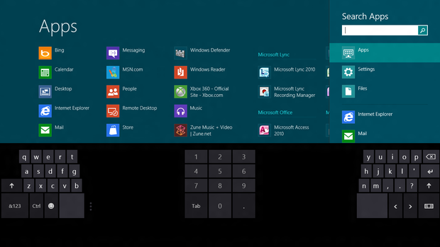
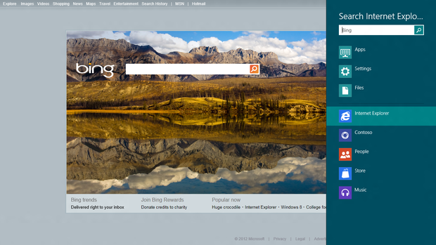
One of the best keyboard functions is that you can pull up an app from the Start screen just by beginning to type. It's ridiculously simple and effective: type "ma" when on the Start screen, and a list of apps with "ma" in their name appear in the center of the screen, but on the right you can flip from Apps to Settings to Files that have the same "ma" string.
Not much will happen when you first connect a mouse to Windows 8. As soon as you move the mouse, though, a scroll bar will appear along the bottom edge of the Start screen. You can then use the scroll bar to navigate through your groups, or you can use the scroll wheel for that--so the vertical motion is interpreted by Windows 8 as a horizontal scroll.
Move the mouse to the lower left corner to reveal your Start screen, or the upper left corner for your most recently visited app. If you then move the mouse alongside the left edge, it will reveal your other most recently used apps.
The mouse has been enabled for apps, too. So in Internet Explorer, for example, a back navigation arrow appears on the left, and a forward nav arrow appears on the right edge. Mouse to the lower-right corner to see reveal the navigation charms, and then mouse up along the edge to use them.
Right-clicking reveals the "app edges," the app-specific options from the top and bottom screen edges, while a button denoted by a magnifying glass on the far right of the scroll bar zooms you in and out of your groups.
If you're on the lock screen, you click and drag it up to reveal the password dialog. It may sound like a lot that's different from the touch workflow, but it's actually quite simple. You can even use the mouse for your picture login.
It's impressive how well Microsoft has been able to replicate the touch workflow with the mouse and keyboard. I don't think we've ever seen the two integrated quite like this before. The multiple ways to interface with the interface also will go a long way towards convincing previous Windows owners and perhaps even skeptics that Windows 8 is all that and a bag of chips. Most importantly, though, both work well with your apps.
Features
From social and security to sync, Windows 8 lives on the cusp of what's expected from a modern operating system. And if it's nothing else, Windows 8 is integrated.
Windows 8 is quite the social butterfly. Not only can it shmooze with the best of them, it actually may be the best. If you're looking for an integrated social experience, Windows 8 comes very close to having it all. Unlike iOS, which requires you to dive into apps as if they were buckets of specific information, Windows 8 is broad and expansive. Start screen tiles are natively integrated with your apps; it is impossible to de-couple them, and I can't see a reason for why would you want to.
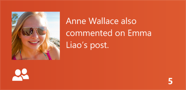
Tiles surface information as it comes in, not unlike peering through a window. See what Microsoft did there? So the Mail app previews recent e-mails; the Calendar app shows your next appointment. You can also set this information to surface on your lockscreen, although the version of the beta I tested could only surface detailed previews from the Calendar.
Contacts from multiple sources are integrated, too, in the People app. When it recognizes the same contact from different networks, it merges them. I found most merged without fail, although there were some oddities. Physical addresses appear with a link to Bing Maps for quick lookups, and accounts that are added to one app--such as People--cross over to other related apps, like Messaging.
Search is global, and includes data from all your apps that have activated the search hooks. Of course, this being Windows, you can easily tweak those settings.
Although the Windows Store wasn't open at the time this First Take was written, Microsoft has said that Windows 8 will sync apps through the Store. There's also a Live SDK that developers can use to hook into the single sign-on, and the aforementioned SkyDrive for file sync. So as your apps are integrated with each other and Windows 8 as a whole, they are also syncable. Use your Microsoft login on any Windows 8 computer, and instantly your apps, settings, files, and browser history will get pulled down.
The beta of Internet Explorer 10 continues on the path dictated by IE 9. IE 9 and 10 are the most standards-compliant versions of Internet Explorer yet, as well as recognized by several sources as extremely good at blocking malware and phishing.
There's also stuff you're likely to never encounter that's protecting you, like Trusted Boot for double-checking system integrity and SmartScreen to protect you from phishing and malware. There are features like XBox Game and XBox Companion apps for pulling XBox content into Windows 8; a new Refresh option that will re-install Windows 8 without deleting your data; and multiple monitor support for showing Start on one screen and the desktop on the other.
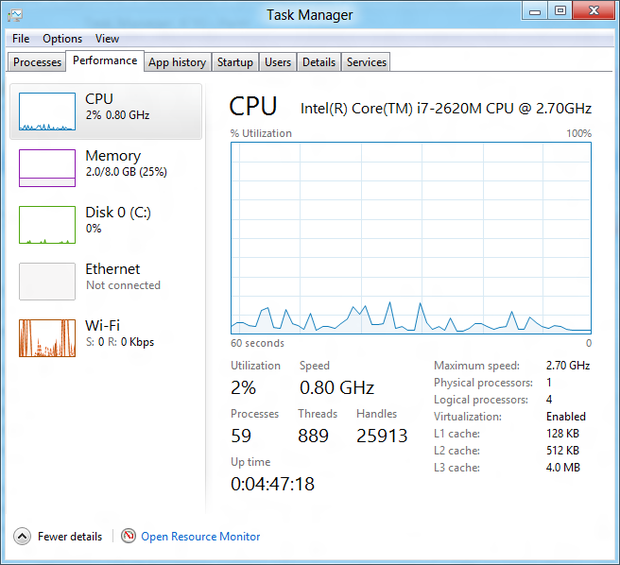
Some people may find it jarring that most of the Windows utilities appear in the Windows 8 desktop screen, even when you launch them from the Start screen. Still, Microsoft has made some effort to make them more accessible. The Task Manager, for example, has been redecorated with colors, charts, and tabs.
As far as default features are concerned, though, Windows 8 beta presents a solid baseline of apps and functionality to get you started. Don't be surprised if hardware manufacturers are allowed to insert their own preferred apps by the time that Windows 8 ships in the second half of this year.
Performance
One important aspect of Windows 8 that I haven't gone in-depth on yet is that it feels quick. You swipe and you're there. Tap and you're there. Mousing around feels just as zippy, and there's a speed and responsiveness to Windows 8 that no other version of Windows has ever had. If there's a third pillar supporting this massive overhaul alongside the integration and the touch interface, it's that Windows 8 zooms.
All of which is even more impressive considering that my demo hardware was a Samsung tablet designed for Windows 7. Shutdown times weren't impressive, taking around a minute. Boot up was blazing, though, taking between 10 and 13 seconds to get to the login screen over three cold boots. From the login screen to the Start screen took under three seconds in each of three cold boots.
Microsoft has said that Windows 8 is designed to sip on battery life. We didn't get the opportunity to benchmark precisely how accurate that claim is, but after heavy daily use for six days straight, I only had to plug in this older-model tablet once a day. It also was good about keeping a charge when unplugged and not in use, something that has not been true of many tablets currently on the market.
Conclusion
It would be beyond shocking if Windows 8 landed like Vista did. This is a tight consumer experience, with features both new and familiar, and in a refreshingly different package. Hardware makers are on-board, Redmond says developers are investing heavily in it, and it's earning its buzz because there's nothing quite like it out there.
Businesses will probably eat it up, as will some early adopters and, of course, the Windows die-hards. But will it take off with the average consumer? Microsoft has ceded a lot of ground to Apple on the tablet, and even some of my colleagues at CNET are surprised when jumping from Metro to desktop screens. Perhaps most damning of all, very few people are able to understand the concept of the edges without a 10-second tutorial. It's not much, but it's enough that if it goes unaddressed, people will abandon Windows 8.
I think there's room for a third player in the tablet game, and Google has left the door open for a good fight over the number two slot. But I also think that approaching Windows 8 as a larger smartphone, as many people have been doing with tablets, will lead to frustration. It's decidedly not that.
Windows 8 is an attempt to unify the desktop and the tablet. Microsoft has nailed the operating system, given that it didn't have much choice if it wanted to compete in the tablet space. Too much of Windows 8's fate resides on partnerships, though. It depends on hardware, affordability, how closely the pitch to consumers matches the reality of adoption, and, frankly, what Apple does. Ultimately, Microsoft has control over only one of those, and it's only partial control at that.
There's a long, narrow road ahead for Windows 8. It could be the next big thing, but there's not much room for missteps.
This article first appeared at CNET under the headline "Windows 8 Beta: Hands-on with Microsoft's tablet-friendly OS."
