NOAA's "new normal" climate report is anything but normal
Just a quick glance at the new U.S. Climate Normals maps published by the National Oceanic and Atmospheric Administration (NOAA) on Tuesday is enough for most climate scientists to say, "I told you so." And it's not just because the maps show a warmer and wetter nation, as one would expect with global warming; it's also the specific geographic pattern of those changes.
That's because for decades climate scientists and their computer models have projected the regions that should expect the most warming, the most drying and the biggest increase in precipitation due to human-caused climate change. NOAA's new maps are clear evidence that this impact is now being felt.
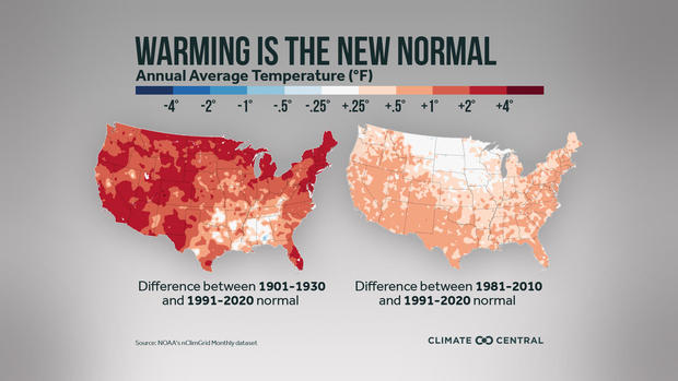
It doesn't take a climate scientist to see the changes that have occurred. In the maps below, using NOAA data, Climate Central illustrates the warmer temperatures the U.S. has experienced. When comparing the latest "normals" to what used to be normal a century ago, the difference is clear — seen in red from coast to coast.
The map on the left depicts the updated climate "normals" compared to the normal temperatures of the early 20th century (1901-1930). In that time the U.S. has warmed an average of 1.7 degrees Fahrenheit. But the shades of the map show that not all areas are warming uniformly, with the darker red indicating temperature increases in some regions of 2 to 4 degrees Fahrenheit.
The map on the right is more muted in tone and shows the difference between recent 30-year averages, comparing the 1981-2010 normals to the new 1991-2020 normals. While the new normals are just 10 years removed from the earlier set, the changes are still significant. In that time the nation has warmed an average of half a degree Fahrenheit.
That may not sound like much, but small changes in the normals mean much larger changes in the extremes like heat waves, droughts, wildfires, floods and hurricanes. And hidden within the pattern of changes are interesting clues into how climate change will impact us now and into the future.
Defining the new normal
Every 10 years NOAA releases a new set of "climate normals" — what is considered normal, typical or average weather in a given location at a given time of year. To ensure that these normals are not subject to the ebb and flow of yearly weather, these averages are based on 30-year time periods to even out any short-term swings.
The new normal baseline is calculated from 8,700 weather stations operated by NOAA across the U.S. and its territories. The data includes information on temperature, precipitation and other weather variables.
So why update the normals every 10 years? First, it is required by the U.N.'s World Meteorological Organization. But on a practical note it is necessary to accurately reflect the state of the climate. These "normals" allow meteorologists, like myself, to compare the weather on any given day with what is historically expected, to give the public a gauge of how typical or extreme the weather is at any given moment.
"Keeping weather and climate data updated is important for the government officials and business owners who rely on it for decisions such as clothing, tourism, and construction companies, utilities, farmers, and city planners," explains Bernadette Woods Placky, chief meteorologist at Climate Central. "But the fact that NOAA needs to keep pushing average temperature data higher is the sign of something bigger —the longer-term warming."
But some climate scientists, like Michael Mann of Penn State, don't love the system of reporting new normals. As he told The Associated Press, Mann prefers using a constant baseline because updating what is normal for present-day conditions obscures the long-term warming trend and makes the warming due to climate change seem less significant. "Adjusting normal every 10 years perverts the meaning of 'normal' and 'normalizes' away climate change," said Mann.
What the data reveals
Since the 1800s the globe has warmed by around 2 degrees Fahrenheit. Nine out of 10 of the warmest years on record worldwide have all occurred in the past decade.
A recent study by NASA proves that all recent warming is related to humans' burning of fossil fuels and the resultant amount of heat-trapping greenhouse gases and aerosols in the atmosphere.
But because of regional variations in geography like ice cover, water and land type, some regions warm much more or less rapidly than others. For instance, the Arctic regions are warming at three times the average global rate due partly to rapid changes in ice cover and the impact of local feedback.
In the United States, NOAA's new climate normals reveal that our nation is about on pace with the global average of warming. What's more, the pattern of recent regional changes in our climate validate scientists' understanding of how man-made climate change is unfolding.
"We're really seeing the fingerprints of climate change in the new normals," said Michael Palecki, the project manager of NOAA's latest climate normals update. "We're not trying to hide that. We're in fact reflecting that."
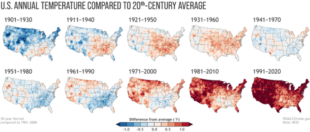
These climate change fingerprints are best illustrated by using side-by-side comparisons of previous 30-year climate normals, pictured below. The warming trend could not be more apparent when comparing the early 20th century (the map at the top left) with the latest two decades (bottom right).
But there are subtleties in the data. Western and northern states are clearly warming faster. The Southeast is warming less fast. Sean Sublette, a meteorologist from Climate Central, says that many of these differences in warming are due to differences in the presence of water.
"As a general rule of thumb, a warming climate intensifies the water cycle of evaporation, condensation, and precipitation. So dry climates get drier. Wet climates get wetter," Sublette explains.
In the West, the terrain is generally dry.That means as the climate warms more of the excess heat from climate change goes directly into warming the air temperature, not evaporating moisture. In the Southeast the opposite is true. The moisture-laden climate there means that much of the heat is used to evaporate water rather than directly heating the air, which explains the slower rate of warming.
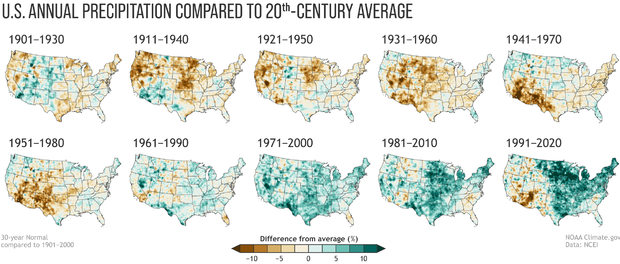
These same physics also help illuminate some of the trends in U.S. precipitation. While not quite as clear-cut as temperature, the maps below show a clear trend of increasing wetness in the East and drying in the Southwest.
A warmer Gulf of Mexico allows more moisture to be evaporated and transported northward, falling as rain and snow. Also a warmer U.S. means that more of that rain and snow on the ground is re-evaporated, enhancing precipitation even more — a positive feedback loop.
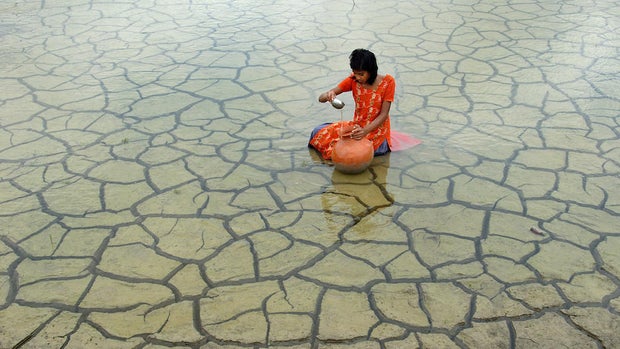
In the West, that feedback loop is negative. As precipitation becomes less consistent in the Southwest due to climate change, the ground becomes drier. With less moisture on the ground, air temperatures increase even more, drying out the ground even more. The lack of soil moisture means less rain falls locally. This negative feedback is how drought begets drought and is a contributing factor to why the region is going through one of its worst droughts in modern history.
While some of the recent drying in the Southwest can possibly be explained by natural variability, the long-term trend from climate models is for more drying as the climate continues to warm and rainfall becomes more variable.
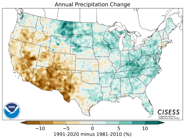
In the shorter term, changes in temperature and precipitation are not quite as stark but still very apparent. The maps below compare the climate normals from 1981-2010 with this new update of 1991-2020. Most of the U.S has warmed in the past decade, with the exception of parts of the Northern Plains states.
As for why the Northern Plains have not warmed in the recent decades, there are some common theories but it is still an active area of research. Some climate scientists think it has to do with a more wavy jet stream, theorized as a result of faster heating of the polar regions, allowing cooler Arctic air to be displaced further south. Other scientists say it could be greater snowpack and increased cloud cover. Some say it's likely all of the above.
But Sublette says another common explanation for the slight cooling in the Northern Plains states may related to modern farming.
"The early reasoning is likely related to land use — there is now a greater coverage of corn and soybeans in the hotter months," Sublette explains. "Colloquially known as 'corn sweat,' the plants give off more moisture from their leaves... which leads to more evaporation, which has a cooling effect."
In that same area, the maps show precipitation has increased. In fact, the majority of the U.S. has gotten wetter, with the exception of the region that needs the rain most, the southwestern quarter of the nation.
Shifts in average mean large changes in extremes
While the changing pattern of temperature and precipitation may seem subtle when averaged out, these shifts result in real and expensive consequences because of an escalation in extreme weather. A NOAA analysis finds that the number of disasters each year in the U.S. that cause greater than a billion dollars in damage (adjusted for inflation) has more than quadrupled since the 1980s.
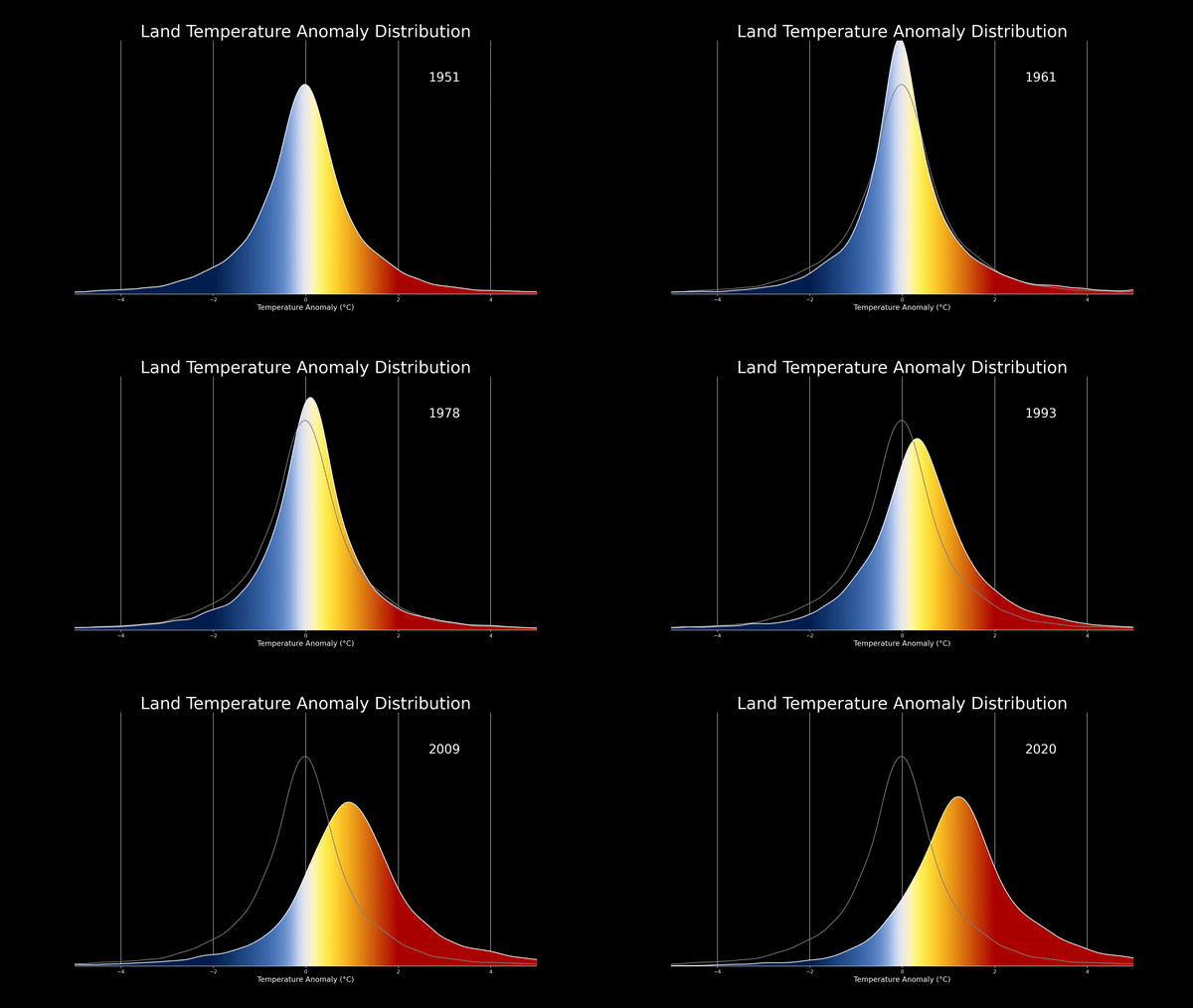
As Sublette explains, a small change in the average means a disproportionate increase in extremes. "So, while 1°F does not sound like much on the average, that means that the frequency of extreme heat goes up much more rapidly."
In the NASA animation below, illustrating normal distribution of temperatures from 1951 to the present, you can clearly see how the shift reveals an even greater increase in extreme temperatures, pictured in the darker shades of red on the right side of the distribution. As they say, "wait for it."
Climate scientist Ed Hawkins has an equally good way of visualizing this effect in the tweet below:
But it is not just extreme heat that a warmer climate portends. More heat means more available energy for just about every form of weather. That means more extreme floods like the Midwest experienced in 2019. It means more extreme droughts and fires like the record-breaking 2020 Western wildfire season. And it means more extreme hurricanes, leading to greater damage and an increase in climate migration.
So, while these updated climate normals may seem like what Climate Central's Bernadette Woods Placky calls "a geeky data moment," she hopes people can see the deeper significance.
"This data update is a moment to pause and take a look at the bigger picture, that we are warming almost everywhere and there is nothing normal about it," she said.
