2,000 years of Earth's climate in one simple chart – and the copycat that isn't what it seems
What were global temperatures the year Jesus was born, during the 12th century when Genghis Khan ruled the Mongol Empire, and in 1503 when Leonardo da Vinci started painting the Mona Lisa — and how do they compare with temperatures in our modern world? There's now a chart for that.
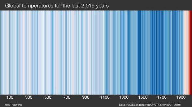
The new visualization peers backwards for 2,000-plus years to estimate, year by year, what average global temperatures were like.
In the image, each line represents a year from 0 to 2019, with blue hues indicating temperatures below the 20th century average and red colors illustrating years when temperatures were above that level.
The shocking red spike as you approach the end of the timeline is a result of the rapid warming that's taken place in recent years.
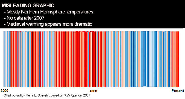
What's less shocking, in this age of disinformation, is that look-alike images with different colored stripes are being circulated online to create doubt about the magnitude of recent climate changes.
The authentic visual above was posted by the climate scientist Ed Hawkins, from the University of Reading in the United Kingdom. Hawkins created the original "Warming Stripes" concept and distinctive graphics which gained widespread attention in 2018 and inspired the hashtag #ShowYourStripes.
While the earlier versions of his graphics typically displayed data from the past 100 to 200 years, this new one goes much further back. It was assembled using data from an international collaboration called Past Global Changes 2K (PAGES2K). Because thermometer data was not widely available until the 1800s, it approximates temperature changes over the 2,000 year period using various records from different "proxy" sources, including tree rings, corals, stalactites, mud cores and marine creatures. Since these proxies estimate temperatures, there are greater uncertainties in reconstructions of the distant past than there are in the modern temperature record.
In climate circles, Hawkins' Warming Stripes pattern has become a rock-star visual — literally — being viewed by millions of people as the backdrop a British rock concert stage, as a sprawling art installation in the center of Berlin, on a mural in Manhattan, and even in the logo of the U.S. House of Representatives' Select Committee on the Climate Crisis.
The success of the visual can be traced to its minimalist roots, says Hawkins. "The simplicity of the stripes means they can present complex data in a visually compelling way, and communicate a key message effectively."
The stripes clearly convey a troubling fact: The rate of warming over the past century is unprecedented in the 2,000-year record. As a result of heat-trapping greenhouse gases from the burning of fossil fuels, average global temperatures have warmed by 2 degrees Fahrenheit since the late 1800s — and the warming trend has accelerated in recent decades.
Hawkins says he decided to graph this extended 2,000-year timeline not solely for educational purposes, but also "to counter the nonsense I saw from the usual suspects" — meaning well-known contrarians who dispute the scientific consensus on climate change.
Hawkins is referring to imposter Warming Stripes images posted weeks ago on Twitter, which appear to show that recent warming is not exceptional and just part of a natural cycle. The alternative — and misleading — graphics mimic Hawkins' design, but show a wide zone of red stripes through many earlier centuries of human history.
Unlike Hawkins's global temperature graphic, this copycat appears to be based on a mishmash of data riddled with gaps and inconsistencies. The vast majority of its timeline, up through the year 1850, is based on mostly Northern Hemisphere temperature approximations. Global temperatures are tacked on from 1850 to 2007. There is no data at all for the most recent 13 years, meaning it fails to include more than a decade of record high temperatures. By excluding those years — which saw about half a degree Fahrenheit of warming, according to NASA — it shifts the scale, thereby accentuating earlier periods of warming like the famous Medieval Warm Period from 900 to 1300 A.D. and giving the impression that recent warming is routine.
CBS News traced the source of the knockoff image to a blog called NoTricksZone, run by Pierre L. Gosselin, an American engineer living in Europe, who's described as a "climate skeptic" by the nonpartisan, nonprofit Inside Climate News. In his blog post, Gosselin credits the data to "R.W. Spencer 2007" — referring to a paper by Roy Spencer, a former NASA scientist who argues that global warming is "mostly natural." Spencer relied on two mismatched sources of data: 157 years of global temperatures from the U.K. meteorological service, tacked onto the end of a reconstruction of historical temperatures by Dr. Craig Loehle, which was based primarily on sites in the Northern Hemisphere. Loehle, an ecologist, has said he is not a climate change "denialist," but criticizes what he calls "silly" claims by mainstream climate scientists.
Loehle's data set is not actually a year-by-year reconstruction. Instead, it's smoothed with a 29-year running average, so it cannot be accurately used to represent yearly temperatures. And while there's nothing inherently misleading about Loehle's data set itself, using it for a Warming Stripes-style chart results in stark discrepancies.
"Loehle's reconstruction is definitely something of an outlier," said Dr. Zeke Hausfather, a data scientist and Director of Climate and Energy at the Breakthrough Institute. Recent human-caused warming "would be literally off the [Loehle] chart."
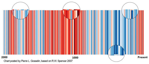
Moreover, irregularities in the color bars on Gosselin's graphic suggest it was something of a haphazard photoshop creation.
Hausfather says images like the one on Gosselin's blog can be misleading. "There is definitely a common tactic of showing paleo-climate reconstructions that end before the present era," he said.
The objective seems to be to confuse the public. Indeed, people on Twitter are comparing the two images — even though their data is not truly equivalent — and reaching their own conclusions. "According to Mr Hawkins there was NO medieval warm period," one user tweeted.
The Medieval Warm Period is frequently cited by people skeptical of climate change to make the argument that the climate system has always gone through natural changes. While that is true, Medieval warming pales in comparison to the recent spike in temperatures around the world brought about by the burning of fossil fuels.
In fact, Hawkins' stripes do reflect slightly warmer temperatures during the Medieval period, compared to the colder (dark blue) years that followed.
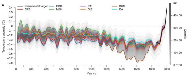
The recent spike in temperatures is not the only reason the Medieval warming in Hawkins' visual appears more subtle. A study published in the peer-reviewed journal Nature this past July revealed that warm spells like the Medieval Warm Period were not actually global, they were regional, and those natural fluctuations in temperature did not occur at the same time in all parts of the world.
Thus, when averaged around the globe, the warming around 1000 A.D. was modest compared to the global warming of the past few decades, as shown in the graph below from the study.
The Nature paper concludes, "We find that the warmest period of the past two millennia occurred during the twentieth century for more than 98 percent of the globe. This provides strong evidence that anthropogenic [man-made] global warming is not only unparalleled in terms of absolute temperatures, but also unprecedented in spatial consistency within the context of the past 2,000 years."
To help raise awareness about our changing climate, with the hope that concerned citizens will get involved, Hawkins and Climate Central have made Warming Stripes images available online for all 50 states, major U.S. cities, and every country around the world.
