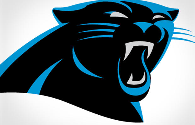
Carolina Panthers unveil "more aggressive" logo
Changing a team logo is a risky proposition.
Inevitably, some fans will bemoan the death of the old look, and assail the font and color scheme of the new one. Recent case in point: The Miami Marlins.
Now it's the Carolina Panthers turn to revamp their image.
For the first time since joining the NFL in 1995, the Panthers have updated their logo. According to a press release, the look was designed to provide a "more aggressive, contemporary look to the logo while making it more three-dimensional for ever-increasing digital use."
So basically, the Panthers are giving their cat a facelift, with an extra dash of menace added to the eye and fangs. It's hardly a departure from the old look - adding some blood to the jowls or whiskers would have really gotten people's attention.
Not surprisingly, teams that are floundering are usually the ones who look to transform their looks. The Marlins finished 72-90 last year but hope the new logo, the move to a new stadium - not to mention the addition of a flamboyant new manager and high-priced free agents - will reverse their fortunes.
As for the Panthers, they finished 6-10. But they won four of their last six games and with Cam Newtown behind center, the future looks bright - and now their helmets look "more aggressive."
