"Minnesota's new flag gets 'A+' for design," expert says
MINNEAPOLIS, Minn. — Minnesota's new state flag passes the test for a good design—according to one flag expert, anyway.
The State Emblems Redesign Commission overwhelmingly approved the new state flag this week after four months of work and more than 2,100 submissions from the public. Members landed on the finalist after adapting it from a winning concept from a Luverne resident.
Throughout the process, the panel looked to the North American Vexillological Association, a group of flag enthusiasts who study flags, for guidance. Its secretary, Ted Kaye, wrote a book on what makes for a good flag design and testified to the commission seeking his expertise.
The design principles, he explained, are flags should be simple, have meaningful symbols and include no more than three colors. They also shouldn't have lettering or state seals on them—like Minnesota's current flag, which is the state seal on a blue background—and should be distinct.
He said the flag design the commission ultimately approved gets an "A+" by these metrics.
"It's different from all other U.S. state flags and actually most flags that I've seen. This special stylized form of the state is a very unusual flag design element," Kaye said of the abstract shape of Minnesota on it.
He noted other states' flags with good designs that residents have embraced, including Maryland, Arizona, Colorado and New Mexico. In these places, the flag's design can be found on merchandise like tee shirts and coffee mugs.
Minnesota, he said, will soon join their ranks.
"There's sort of a positive feedback loop here. And that is: if a state has a great flag design and people love the flag, they love their state more, perhaps," he told WCCO in an interview. "They certainly express their love for the state through the flag more when it's a good design."
RELATED: Answering your new Minnesota state flag questions
Feedback from Minnesotans so far has been mixed. Some love it, some hate it and prefer the original, and others prefer another one of the six finalists.
At one point during a commission meeting, chair Luis Fitch played a YouTube video from the early 1960s in Canada, when the country was going through the process of adopting the maple leaf flag it has today. The change at the time sparked fierce debate.
"You saw that what happened in Canada—people went crazy. And now it's considered one of the best flags in the world," Fitch said. "So I have a feeling Minnesota with some time, they're going love this new flag."
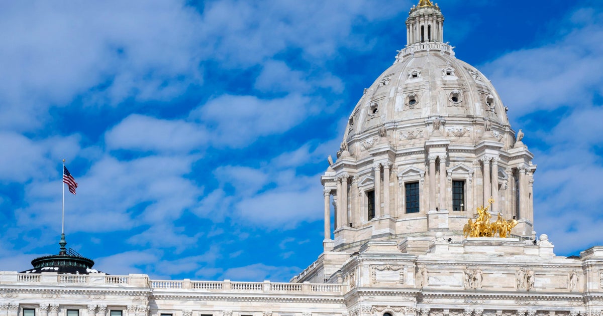
The final flag includes two shades of blue, which is a nod to Minnesota's waters; an eight-pointed star for the "North Star State" that mirrors the design on the state capitol rotunda floor; and an abstract depiction of the shape of the state.
WCCO'S TOP STORIES OF 2023: Legal pot, loony flag designs, Taylor Swift: These were your most-clicked stories in 2023
The flag, along with the new seal, will make its official debut on Statehood Day next May.
Kaye also believes the new flag design will grow on people.
"Through familiarity and understanding the symbolism, people come to love the flag that represents the state they love. And that's my prediction for Minnesota."

