10 home design trends to ditch in 2015
Brass hardware -- out. Big showers -- in.
Home design trends may come and go, but homeowners are always looking for inexpensive, easy ways to increase their property's value. Some of those trends can translate into bigger bucks when it comes time to sell a home, while others can actually drag value down.
Part of figuring out whether to change a design element involves predicting what potential buyers might want down the line, while also considering the needs and tastes of the people who live there today. It's a balancing act for almost every homeowner's budget. The risk? That some design decisions make your home look dated before its time.
We talked to three interior design professionals about which trends to resist and where they would put their renovation dollars instead. Here are 10 trends they think homeowners should steer clear of in 2015.
Kitchen desk
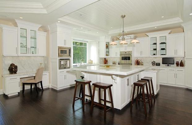
Until recently, lots of interior designers thought it would be useful for homeowners to build a desk space directly into the counter top. People used the space, which was usually about six inches shorter than the average kitchen counter, for storing cookbooks, making telephone calls and paying the bills.
John Petrie, a Pennsylvania-based master kitchen and bath designer, owner of Mother Hubbard's Custom Cabinetry and the 2014 president of the National Kitchen and Bath Association, advises clients to skip the desk -- mostly because those needs no longer exist.
"In many cases today, homeowners don't have a land line," he said. "My wife was one person who got the Southern Living cookbook over and over, year after year; but we don't do that anymore. It's all on her iPad."
Replace it with: Counter space you will actually use, and more kitchen storage underneath.
Putting a TV in a child’s room
According to an August Houzz survey, 35 percent of people plan to put a television in their children's and guest bedrooms.
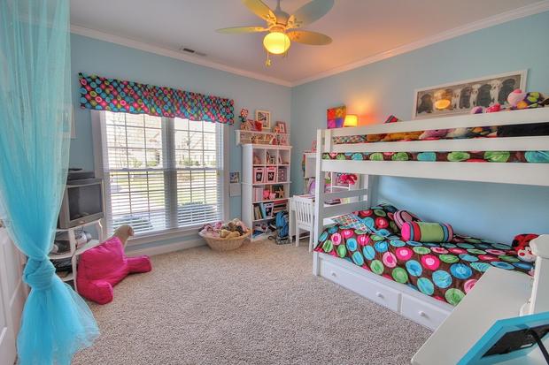
Amy Yin, the award-winning principal designer and owner of Amy Yin Interiors in New Jersey, said she's been seeing more TVs in kids' rooms over the last few years, and she would like to see homeowners move in a different direction.
"We just installed magnetic wallpaper in a preteen's room that looks like linen," she said. "She can put up inspiration from magazines or things she's interested in. She does horseback riding, so it gives her a place to put up her awards. It's a space that rotates and grows with her interests."
Although a TV isn't really a design a feature, a magnetic wallpaper or chalkboard-painted wall is -- so consider if your home might be re-sold to another family. If so, the extra touch could help potential future buyers see their kids in that space.
Replace it with: A play space, bookshelf or something that will spark kids' imaginations.
Chevron prints
Kerrie Kelly, a California-based interior designer, founder of the Kerrie Kelly Design Lab and member of the American Society of Interior Designers, believes there's a big difference between the classic herringbone print and over-saturated, overused chevron.
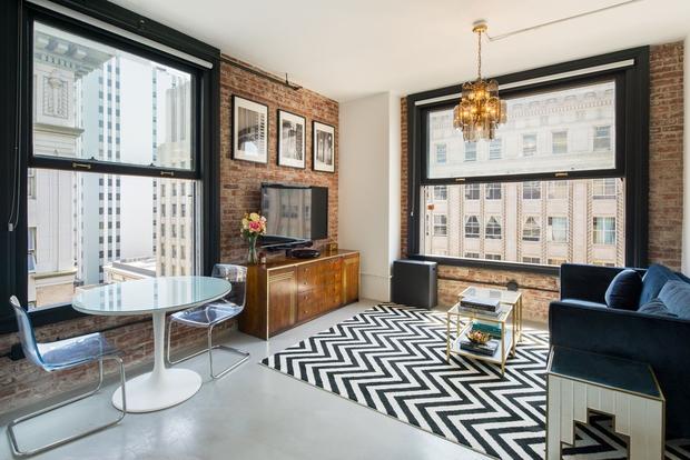
She's not alone. According to the 2015 Zillow Digs Home Trend Forecast, chevron was "one of the most overused trends of 2014."
Bold and often brightly-colored chevron pillowcases and area rugs are likely a passing fad, but luckily they're not too expensive to update. Wallpaper, on the other hand, is a little trickier.
Replace it with: Solid-colored, textured fabrics or pieced animal hide.
Whirlpool bathtubs
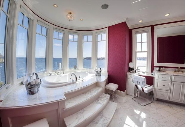
In the 1980s, whirlpool bathtubs were a hot commodity. Now, Petrie has noticed that people aren't using them as much as they used to.
"They just take up a lot of real estate that can be used in other fashions that tend to be more desirable for people today, like bigger showers or his-and-hers vanities," he said.
They can also cost homeowners big bucks when it comes time to pay the water bill. One whirlpool bath can use between 80 and 100 gallons of water, he added.
If you still want the look and feel of a spa-like master bath, a sitting area or regular soaking bathtub can create a similarly relaxing environment and save you money in the long run.
Replace it with: A shower with more space, a seat, shelves for bath products and a rainwater showerhead.
Naked windows
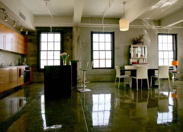
Over the last two years, more people have been inspired by trendy urban loft spaces to embrace minimalist design -- and not always in a good way.
"There's just nothing on people's windows," Yin said. "It's completely open. There's no privacy; there's nothing to protect from glare. There's no color, personality, texture or softness, which is what window treatments can do."
But Yin doesn't recommend going back to the days when people hung three layers of thick, heavy fabric in front of every natural light source. There are plenty of window treatments that are sheer, simple and minimalist while still being functional. They bring light in without looking dated.
Replace it with: Shades or simple panels that can leave the windowpane open or provide privacy.
Mirrored furnishings
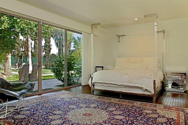
Gone are the days of "Hollywood Glam" mirrored and metallic furniture, according to Kelly, owner of Kerrie Kelly Design Lab. The trend may once have been the so-called red lipstick of interior design, adding a bit of easy glamour to a dull room, but she says such accents are now overdone.
While it may be tempting to hang on to a bedroom set that makes your room feel larger (and a little more like a disco ball), shiny furniture is best used sparingly as an accent.
Replace it with: A mix of wooden and metal furniture that is complementary without completely matching.
Over-the-range microwave
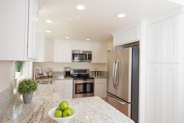
People started putting microwaves over the kitchen range about 20 or 25 years ago, Petrie said. While they can save some space, they're not always the most attractive or ergonomically safe option.
"If designed properly, they're very safe," he said. "But in reality they can be placed too high. If you're 5-foot-5, I can put the microwave at a good height for you. But if you sell your home and the new homeowner is 4-foot-11, she's going to have a hard time reaching her new microwave."
The popularity of open-concept kitchens is also prompting more homeowners to choose stylish range hoods that are nicer to look at from the family room, he said.
Replace it with: A microwave drawer installed underneath the counter top.
Tiled counters
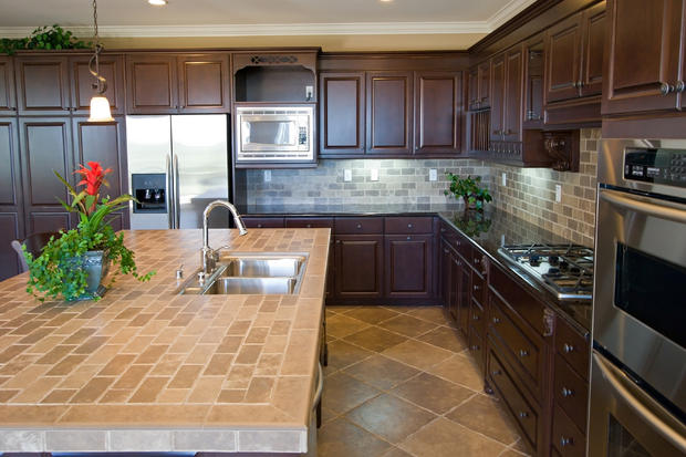
Tiled counter tops have been around as long as any of us can remember, but their popularity has resurfaced in recent years. The trend made Houzz's list of most popular kitchen counter top materials in 2014, partially due to its affordability compared to materials like granite, copper or quartz. However, Kelly said not all homeowners are thrilled with the cheaper tiles once they realize how much cleaning is involved.
"No one wants to clean grout on a horizontal tile surface ever again. It doesn't matter how tight the grout lines are."
According to Kelly, ditching this trend now could be worth the effort since it will improve the value of a home.
Replace it with: A quartz slab.
Brass hardware
One of the least expensive and easiest ways to update your home in a hurry is by changing out the hardware in the kitchen and bathroom. Homeowners don't need any expertise -- just a small budget and a screwdriver.
Petrie, of Mother Hubbard's Custom Cabinetry, says brass hardware is one design element that could use some updating. To replace brass hardware or other knobs, be sure to choose a size that will cover the "footprint" of whatever is currently installed.
"Let's say you're changing the knobs on your cherry cabinets," he said. "The cherry patinas over time and warms up, gets darker and warmer in color. As that changes, the part hidden under the knob doesn't change at all. If the new knob doesn't have as big a footprint, you'd see a ring there, and that's not very desirable."
Replace it with: Brushed or satin nickel hardware.
"Faux" finishes
According to Kelly, today's interior design approach emphasizes authenticity. The prevalent use of natural materials harkens back to midcentury modern design, which used a lot of wood, stone and glass.
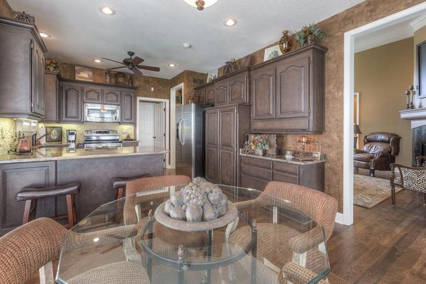
That means it may be time to get rid of the fake wall treatments and re-paint any faux furnishings, such as a dresser or bed frame painted to look like an antique.
"Faux treatments, such as Tuscan paint finishes and marbled columns, are out and have been replaced by eco-chic and authentic materials in their home," Kelly said.
Replace it with: A solid coat of paint.
